Becoming a Data Scientist
Research Question
Which city in the Ann Arbor region is the best for individuals moving for work who want to live close to Ann Arbor? Factors to consider will be home value, distance to Ann Arbor, and commute time to Ann Arbor.
Background
This assignment requires that you to find at least two datasets on the web which are related, and that you visualize these datasets to answer a question with the broad topic of economic activity or measures (see below) for the region of Ann Arbor, Michigan, United States, or United States more broadly.
You can merge these datasets with data from different regions if you like! For instance, you might want to compare Ann Arbor, Michigan, United States to Ann Arbor, USA. In that case at least one source file must be about Ann Arbor, Michigan, United States.
You are welcome to choose datasets at your discretion, but keep in mind they will be shared with your peers, so choose appropriate datasets. Sensitive, confidential, illicit, and proprietary materials are not good choices for datasets for this assignment. You are welcome to upload datasets of your own as well, and link to them using a third party repository such as github, bitbucket, pastebin, etc. Please be aware of the Coursera terms of service with respect to intellectual property.
Here are the assignment instructions:
State the region and the domain category that your data sets are about (e.g., Ann Arbor, Michigan, United States and economic activity or measures). You must state a question about the domain category and region that you identified as being interesting. You must provide at least two links to available datasets. These could be links to files such as CSV or Excel files, or links to websites which might have data in tabular form, such as Wikipedia pages.
Retrieving the datasets
I began with importing the requred libraries and previewed the data in Excel since the files were relatively small.
%matplotlib notebook
import pandas as pd
import numpy as np
import matplotlib as mpl
import matplotlib.pyplot as plt
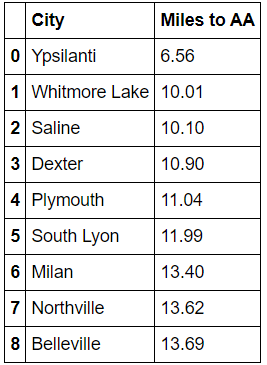
I scraped cities and their distances from Ann Arbor, only focusing on cities within 15 miles.
city_dist = pd.read_excel('Ann Arbor City Dist.xlsx', usecols= [0,1])
city_dist.rename(columns={'Town': 'City', 'mi.': 'Miles to AA'}, inplace=True)
city_dist = city_dist[city_dist['Miles to AA'] < 15]
city_dist
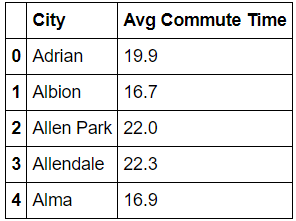
I scraped commute time to Ann Arbor from different cities.
comm_time = pd.read_excel('Mean Commute Time MI Cities.xlsx')
comm_time.rename(columns={'Value':'Avg Commute Time'}, inplace=True)
comm_time.head()
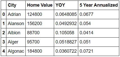
I scraped average current home values from Zillow for cities near Ann Arbor and the YOY changes.
home_value = pd.read_excel('mi.xls', header=2, usecols=[0,3,6,7])
home_value.rename(columns={'Region Name':'City', 'Current':'Home Value', 'Year Over Year':'YOY'}, inplace=True)
home_value.drop([0], inplace=True)
home_value.reset_index(inplace=True)
home_value.drop(['index'], axis=1, inplace=True)
home_value.head()
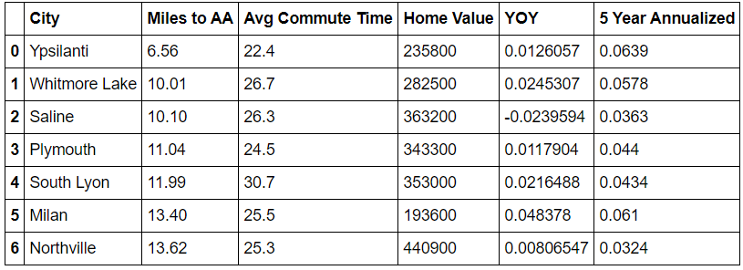
Then I merged the 3 data sets on City.
city_travel = city_dist.merge(comm_time, on='City')
city_house_info = city_travel.merge(home_value, on='City')
city_house_info
Creating the visualization
First, I created the subplots which I will use for the visualization.
fig, (ax1, ax2) = plt.subplots(1,2, figsize=(10,6))

ax1.set_xlim([6, 14])
ax1.set_ylim([22, 32])
ax2.set_xlim([-.04, .06])
ax2.set_ylim([.03, .07])
Next, I graphed a scatter plot showing relationship between distance to Ann Arbor and commute time to determine closest viable locations based on distance and commute. I excluded two cities initially so as to manually determine the label location for aesthetic reasons. The color map includes the home value to showcase areas with higher housing prices.
# Cities to manually move labels.
label = city_house_info['City'][~city_house_info['City'].isin(['Ypsilanti', 'Northville'])]

# The rest of the cities for the visualization.
x = city_house_info['Miles to AA'][~city_house_info['City'].isin(['Ypsilanti', 'Northville'])]
y = city_house_info['Avg Commute Time'][~city_house_info['City'].isin(['Ypsilanti', 'Northville'])]

# Creating the actual scatterplot, and moving the labels so as to not overlap.
ax1.scatter(city_house_info['Miles to AA'], city_house_info['Avg Commute Time'], c=city_house_info['Home Value'], cmap='Greens', s=65)

for x,y,label in zip(x, y, label):
    ax1.annotate(label, xy=(x,y), textcoords='offset points', xytext = (-10,-2), ha = 'right', fontsize=10)

ax1.annotate('Northville', xy=(13.62+.06,25.3), textcoords='offset points', xytext = (-10,-8), ha = 'right', fontsize=10)
ax1.annotate('Ypsilanti', xy=(6.56,22.4), textcoords='offset points', xytext = (10,0), ha = 'left', fontsize=10)
ax1.set_title('Commute Times Near Ann Arbor', fontsize=14)
ax1.set_xlabel('Distance to Ann Arbor (mi)')
ax1.set_ylabel('Average Commute (min)')
Finally, I graphed the relationship between YOY change in home value and the 5 year change in home value to determine which cities are improving in value and which may be on their way there. Again, I initially excluded some cities to manually input their label locations later. I included the color range again to show the average home value.
# Cities to manually move labels.
yoy = city_house_info['YOY'][~city_house_info['City'].isin(['South Lyon', 'Saline'])]
five_yr = city_house_info['5 Year Annualized'][~city_house_info['City'].isin(['South Lyon', 'Saline'])]
label1 = city_house_info['City'][~city_house_info['City'].isin(['South Lyon', 'Saline'])]

# Creating the scatterplot, and moving labels so as to not overlap.
g2 = ax2.scatter(city_house_info['YOY'], city_house_info['5 Year Annualized'], c=city_house_info['Home Value'], cmap='Greens', s=65)
for yoy,five_yr,label1 in zip(yoy, five_yr, label1):
    ax2.annotate(label1, xy=(yoy,five_yr), textcoords='offset points', xytext = (-10,-2), ha = 'right', fontsize=10)

ax2.annotate('South Lyon', xy=(0.0216488,.0434), textcoords='offset points', xytext = (10,-2), ha = 'left', fontsize=10)
ax2.annotate('Saline', xy=(-0.0239594,.0363), textcoords='offset points', xytext = (10,-2), ha = 'left', fontsize=10)

ax2.set_title('Change in Home Value in MI Cities', fontsize=14)
ax2.set_xlabel('5 Year Annualized (%)')
ax2.set_ylabel('YOY (%)')
cbar = fig.colorbar(g2, ax=ax2)
cbar.set_label('Home Value ($)')

# Further tuning of the graphs was required after previewing the visualization.
fig.tight_layout(pad=1.08, w_pad = .5)

ax1.grid(False)
ax2.grid(False)


ax1.axhspan(22,27,xmin=0,xmax=.5, fc='gold', alpha =.7,zorder=0)
ax1.axhspan(27,32,xmin=.5,xmax=1, fc='rosybrown', alpha =.7,zorder=0)
ax1.axhspan(22,27, xmin=.5, xmax=1, fc='silver', alpha =.7, zorder=0)
ax1.axhspan(27,32, xmin=0, xmax=.5, fc='silver', alpha =.7, zorder=0)

ax2.axhspan(.05,.07,xmin=.5,xmax=1, fc='gold', alpha =.7,zorder=0)
ax2.axhspan(.03,.05,xmin=.5,xmax=1, fc='silver', alpha =.7,zorder=0)
ax2.axhspan(.05,.07,xmin=0,xmax=.5, fc='silver', alpha =.7, zorder=0)
ax2.axhspan(.03,.05, xmin=0, xmax=.5, fc='rosybrown', alpha =.7, zorder=0)
Results and Conclusions
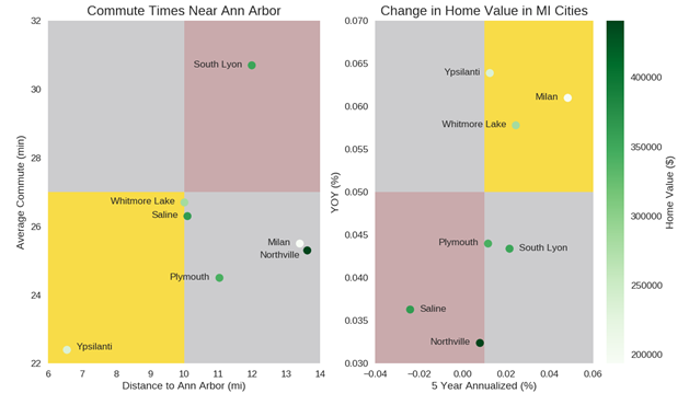
The visualization is meant to help answer the question of which city surrounding Ann Arbor is best for someone moving for a job who want to live close to Ann Arbor. Only cities within 15 miles of Ann Arbor were considered, and only results which were in all datasets. Points within the top 50% of both variables were given a gold ranking, while points in the top 50% of one variable and bottom 50% of another variable were given silver rankings. Finally, cities in the bottom 50% of both variables were given bronze rankings.
The first scatterplot plots average commute times with the distance to Ann Arbor from the city. The top cities based on these variables were Ypsilanti, Whitmore Lake, and Saline. This is important for individuals who want to live close to the city and not experience a long commute to their job.
From the second scatterplot we compare the Year Over Year Percent change in home value with the 5 Year Annualized percent change in home value. The top cities based on these variables were Ypsilanti, Whitmore Lake, and Milan. This is important because someone who is looking to buy a house in the area wants to purchase in a city where home values are currently increasing, but also show a pattern of increasing over time. This shows that the one-year increase is not spurious.
Lastly, the color bar shows the range of actual home values. Higher home values usually depict a nicer area to live, however not always. Areas which are growing in value (see Scatterplot 2) may have low home values because the area is just now growing in popularity and quality. The top home value cities were Northville, Saline, South Lyon, and Plymouth.
Overall patterns in the data show that the overall area surrounding Ann Arbor is increasing in value and most likely quality, so it might be a safe option to move to an area with lower housing prices. As a result, when considering factors from Scatterplot 1 Whitmore Lake seems like a good option for a balance of all factors.